FOOD SUPPLY CHAIN BUSINESS TEROVA

Terova
Mabbly built a new corporate brand and offering for a food conglomerate from scratch – from naming & trademarking to product strategy to purchasing the URL.com. An internal initiative blossomed into a portfolio of innovations serving modern society and health conscious brands with premium, sustainable ingredients and products.
Objective
Mabbly was tasked with developing a global business unit and brand for a $1B food corporation. Mabbly crafted a creative strategy brief to educate siloed brand teams on key insights, including the origins of NewCo, market landscape, target industries and buyers, and executive preferences.
Outcome
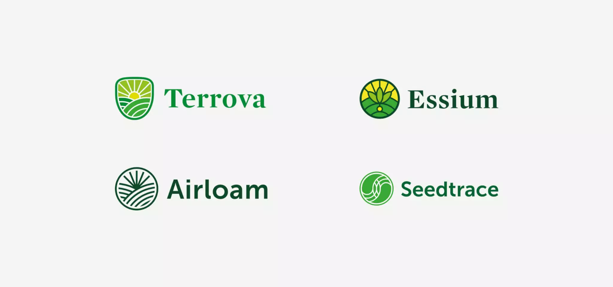
Each of the NewCo brand names Mabbly developed and presented were trademarked by the parent company for future product names. In addition, Mabbly is launching the brand globally with the newly appointed CEO of TEROVA™.


Naming NewCo
Mabbly went through the entire creative naming process and performed in-depth research into select brand names’ ability to be trademarked, in liaison with global trademark attorney.
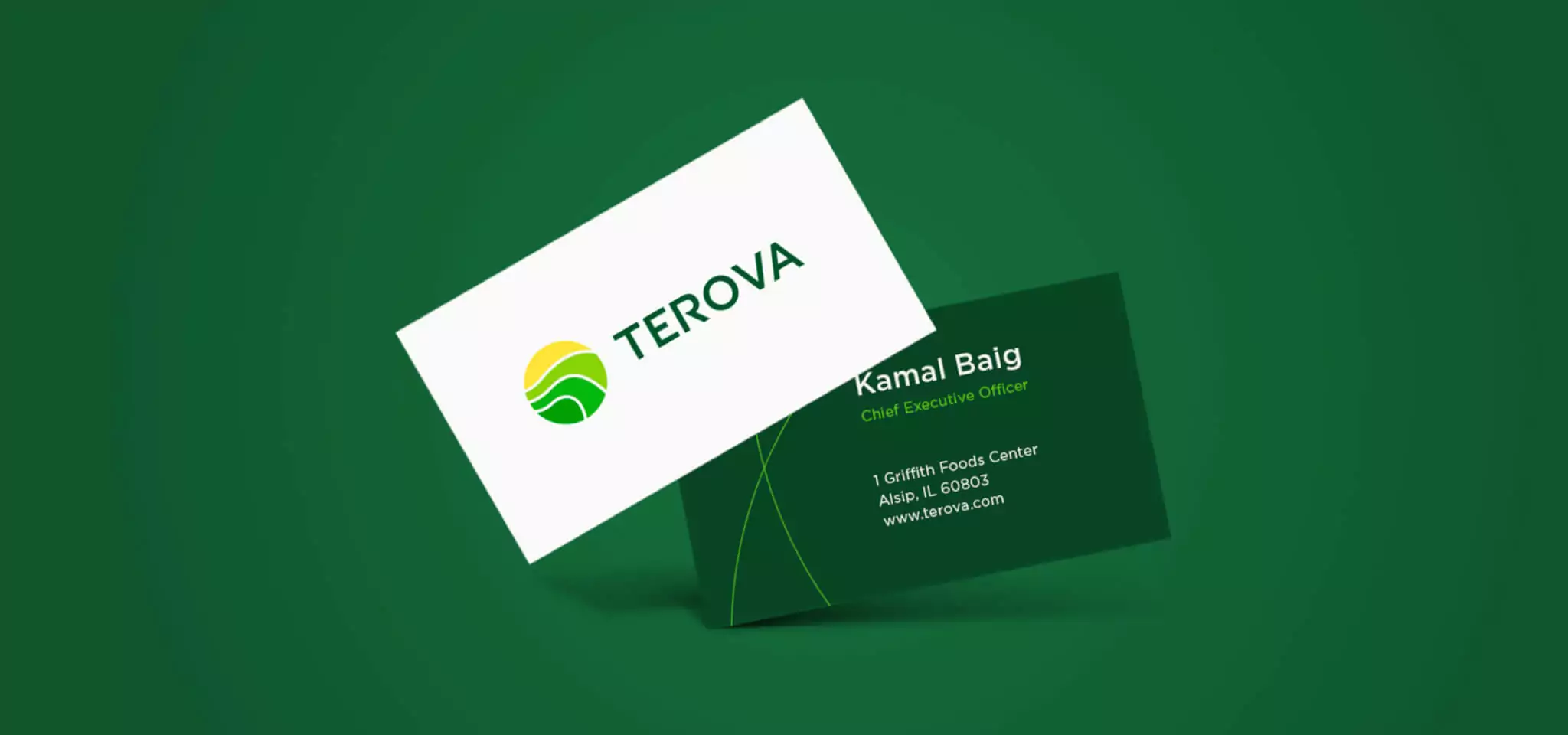


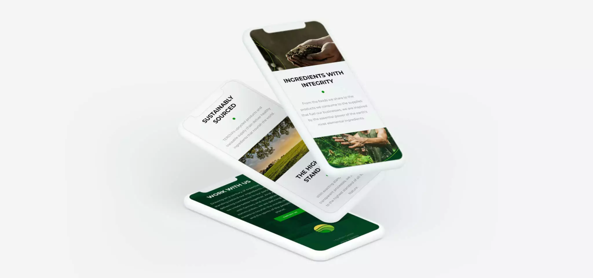
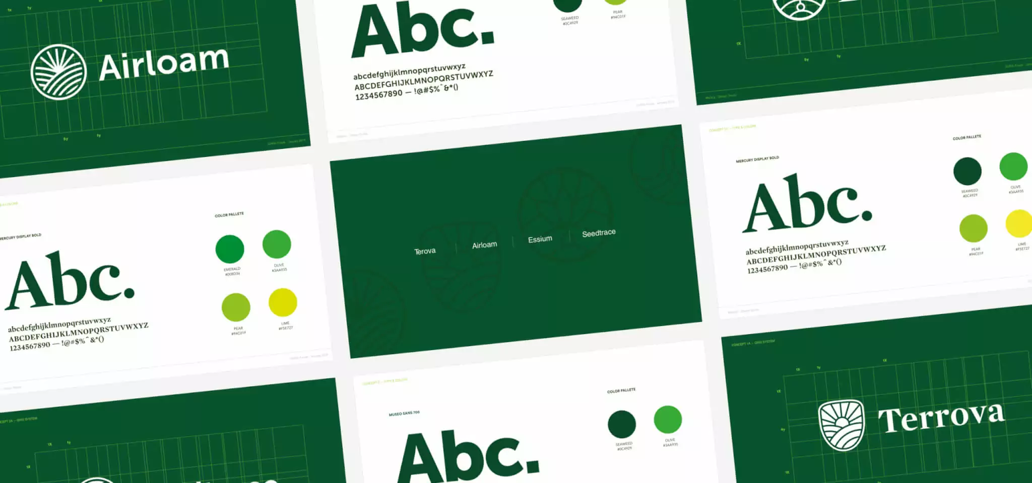
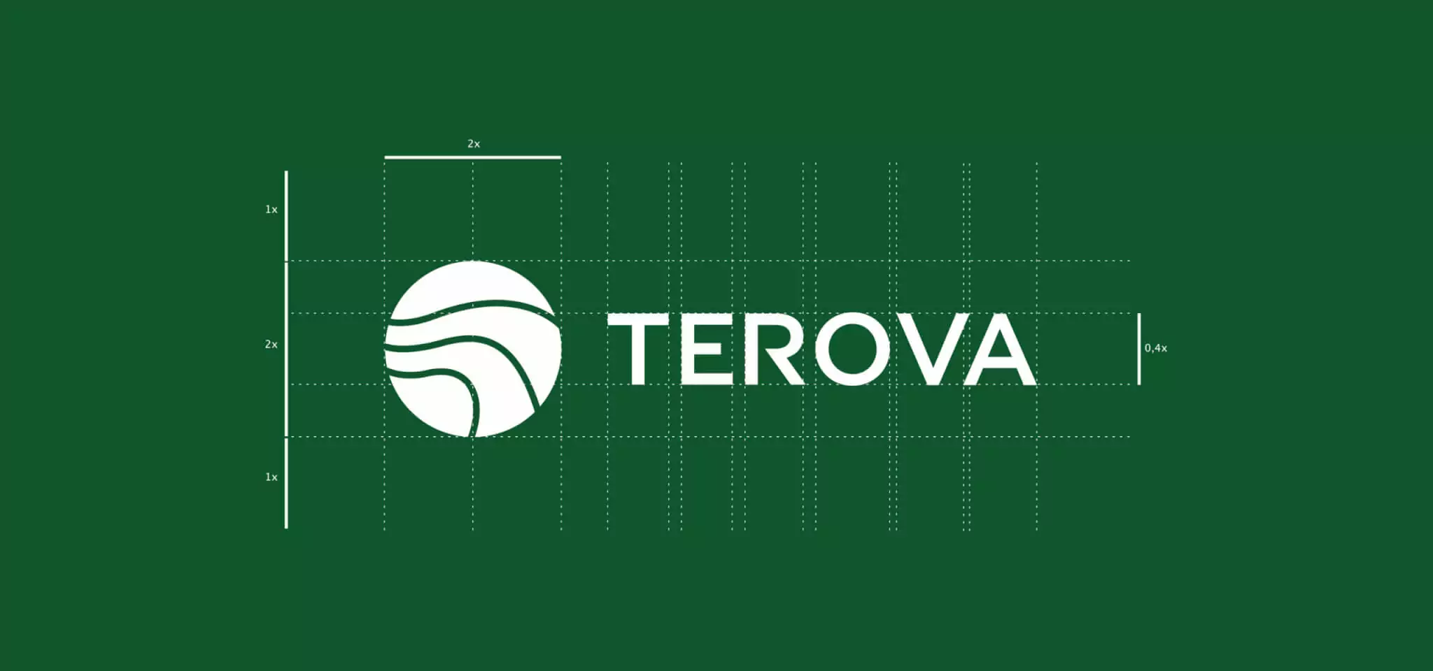
Building the brand
After TEROVA™ was client approved and trademarked, we developed a series of studies including brand, symbol, design, and feasibility. A design system was developed to scale the new visual identity across the series of stakeholder communication channels. We began with a visual blueprint for expressing and capturing the organization’s essence of honesty, expertise, and purpose. This visual blueprint was then implemented into both offline and online communications.