
When you talk about boosting online visibility, terms like search engine optimization and inbound marking often dominate the conversation. True, for boosting your ability to be seen with the online search engines but that isn’t the only type of visibility that you should be concerned about when it comes to your website. Boosting visibility with the search engines might bring you massive amounts of traffic, but once they arrive at your website your visitors need to be able to find what they are looking for and what you want them to see.
There are quite a few techniques that you can employ to help boost your site’s visibility. However, if you had to break it down to the ones that are most important while enduring all of the different trends and fads that come and go then these five would be the best route to take.
Make it mobile friendly
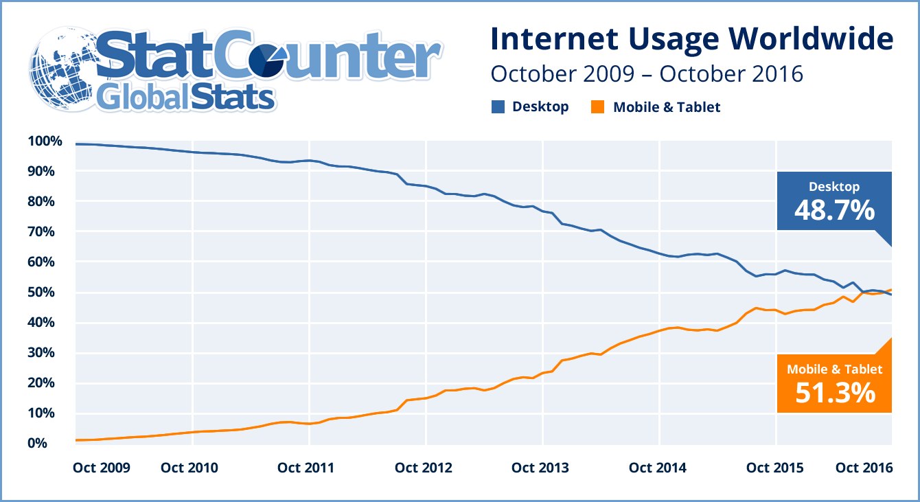
It seems like you can’t find an article written in the last two years that doesn’t advise you to create a mobile friendly website. Given that mobile internet usage worldwide is at 51.3 percent and expected to continue to rise, you can see why so many people insist on making responsive sites a priority. But as a design element, you need to make sure that your strategy goes beyond a responsive web site. You need to make sure that the user experience for your mobile visitors equals that of someone viewing your site on a desktop or laptop.
Make sure that mobile visitors can move through your site by making navigation elements easy for them to use. Call to action buttons should also be easy for people to engage with. One last bit of advice; make it so visitors can scroll through longer form content. It is extremely hard for them to click on small next arrows and even more frustrating when they have to wait for those next pages to load.
Provide for cross browser functionality
You might have the most well designed web site in your industry and your analytics may show that you are driving more traffic that you could have ever imagined, but if your visitors can’t access everything on your website then all of those other efforts are in vain.
It’s not uncommon for web designers or even the site owners to want to use some of the latest trends on their site. Not only does it show that the site is current and that it receives attention, but there are some technologies that can really help engage an audience and help keep them tuned into your message. The problem often occurs when you find out that these technologies don’t always work on every browser; especially on the legacy ones.
You do have a choice; you can post a message telling visitors that they need a modern browser to view your site but then you would leave quite a few people out. The other option is that you can build alternative versions of your pages for people who are forced to use the older web browsers. Using conditional statements, you can serve up alternative content that allows everyone to interact with your site, not just those who are the most up to date.
Speed up your site
 Just about everyone reading this has experienced landing on a website that just keeps loading and loading and…
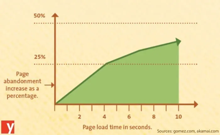
Just like not providing cross browser functionality, building a site that takes too long to load is one of those things that will prevent people from seeing your site. In surveys conducted by Akamai and Gomez.com it was found that nearly half of all people expect a website to load in two seconds or less. After three seconds they abandon the site altogether. While most will stick around for six to ten seconds before giving up, each second it takes for your site to load means more and more people are moving on to somewhere else.
Those first three tips deal with visitor actually being able to see you site. Employing these next two, however, will help them find what they came to your site to find.
Put a call to action on every page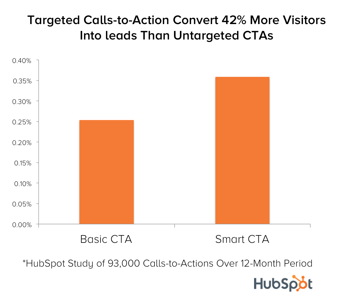
Amazon has one of the most user friendly websites because they make it so easy for visitors to buy from them. Each page has that call to action that someone need only click to get the purchase process started. Of course not all websites are selling products, but every site does have a goal in mind and that call to action should be leveraged at every opportunity because after all, your visitors are here to get something whether it is information or a physical product.
This call to action itself needs to be visible to your audience as well. Better yet, it needs to stand out. One technique that many web designers use is to use contrasting colors for any call to action to really draw attention to it. The more visible you make this, the more confident that your visitors will feel that they can easily find what they came to your site to get.
Remove the clutter
All too often we have trouble deciding what is truly important when it comes to our websites; so we find a way to include it all. Because not everyone lands on the home page when they arrive at your site it becomes easy to rationalize that you need to include everything on every page so that visitors won’t miss anything. This thinking is wrong though. It doesn’t help them find things, it has the opposite effect because it causes your site to become cluttered.
Include only what is necessary on each page. If they arrived at a page other than the homepage it is because they searched for something that led them to that specific page. That’s what they came to find so keep your content and design elements focused on that.
Bonus: Make it easy to navigate
As sites grow it becomes easy to see how navigation bars can quickly grow out of control if you try to add everything to them. Using JavaScript or CSS you can create drop down menus that have subcategories upon subcategories. Again, this does little to help your users and actually makes it harder for them to move from page to page, especially if they are on a mobile device.
Instead of adding every page possible to your navigations menu, only include the main pages on your main navigation element and use alternative menus for secondary pages.
Visibility isn’t just about helping your visitors find your web site, it’s about helping them find things once they are there. Make sure that they have that chance by designing things with their intentions in mind.


